LOADING, PLEASE WAIT..

Enterprise Commerce Platform

Heuristic ReviewUX/UI
Designed an enterprise purchase + setup flow for Voice Services.
Reduced configuration from 9 steps to 3 using order-type specificity and progressive disclosure.

Enterprise voice ordering and service setup for Lumen Voice Digital—redesigned to reduce friction in time-sensitive provisioning.

CHALLENGE
Complex business logic (plans, services, eligibility, steps) must be simplified without losing critical detail or trust.

PROCESS
I map the happy path and key edge cases, then restructure the flow into fewer, clearer steps. The experience uses progressive disclosure so users see what they need now, with details available at the right moment—keeping momentum without hiding information.

Result: 9 steps → 3 steps (validated n=16)

Lumen launched Lumen Voice Digital, a new digital voice product. Their existing Marketplace and service manager were outdated, driving low satisfaction and frustrated messages. We needed a new purchase and management experience that simplified enterprise communications under a single vendor-with unified pricing and invoicing while raising UX maturity

Competitive Analysis

I worked alongside the Design Experience team to conduct a competitive analysis. Our findings revealed that customers tend to conduct thorough online research before making a purchasing decision when it comes to choosing service providers. I examined our competitors’ experiences and studied user behaviors about telephone purchases, installation, and management. Our research involved analyzing digital platform usage, the current state of the telecom market, and user preferences for phone number management.

User research

I went through several reviews and comments posted by users on Lumen’s website and sorted them based on their content and importance to identify key feedback. This feedback helped me pinpoint several issues and gaps that needed to be addressed and improved. To gain more insights from real users, we conducted interviews with real users and gathered valuable feedback that we used to enhance our product. As a result, we created a more user-centered and effective solution. Additionally, I conducted surveys to understand existing user behaviors for phone number purchase and management.

The three steps expands to four only when users are required to submit legal information, keeping the flow at minimum.

Clean hierarchy and predictable patterns

– Strong primary actions, consistent summary modules, and calm layouts that make decision-heavy moments feel manageable.

–Steps were reduced from 9 to 3. Most participants rated the updated flow as “easy” or “very easy,” reporting higher confidence and fewer clicks needed to complete tasks.

Analyzing the flow to reduce steps from 9 to 3 main micro flows easy - to - flow.

Old Number Management Model

Micro flows helped users to manage their inventory.

Making complex flows feel guided

Outcome

Reduced setup friction in a high-stakes service flow

Configuring a service previously required nine steps, creating friction at a critical moment in the journey. Limited guidance—especially acronym-heavy labels—left users uncertain about what to do next, contributing to drop-off and increased customer support volume.

To reduce cognitive load and improve completion, we redesigned the flow around order-type specificity. By separating the experience into clear paths and revealing only the sub-steps relevant to the selected order, we condensed the process into three primary steps. The result is a more focused, lower-friction journey with fewer clicks, clearer guidance, and less overwhelm.

Validation (n=16)

Ease of use
14/16

Rated the current Marketplace pattern as the easiest to use; also rated it 4+ / 5.

Meets needs
14/16

Rated both designs as meeting their needs with 4+ / 5.

Visual appeal
+

The tile-based alternative was perceived as slightly more visually appealing.

Functionality & navigation

Observed behavior and feedback favored the current pattern for its continuous, linear navigation.

Key takeaway

While the existing Marketplace flow remained preferred for its linear navigation, the tile-based alternative was consistently praised for being more approachable and readable—with clearer labeling, better explanation of acronyms, and a perceived reduction in complexity. Users felt it required fewer steps, helping them stay focused and more confident while completing time-sensitive orders.

01
PREVNEXT
Karen Gonzalez is the UX designer for LCC. I would like to recognize her extreme patience with all of the input and the process of aligning everyone on a brand-new product model for Marketplace. During a very tumultuous series of calls, she maintained her cool and kept everyone focused on the goal. On behalf of Julie Clark and the LCC Team, THANK YOU!!!
Testimonial Avatar
Carr, Danielle
SR Manager Product Development
I have the privilege to work with Karen as leads (UX/DX) on LCC and would like to recognize her creativity, open-mindedness, commitment to quality, and innovative mindset. Karen is a pleasure to work with, she always leaves me re-inspired to “build it right” and to be an active participant in contributing to the building of brand through quality products/services/experiences. Not only does she bring new and interesting ideas to the table, but she also freely shares knowledge and expertise and shows up every day with a consistent assumption of positive intent. Grateful for the opportunity to work with her, I appreciate the grounding and balancing affect her presence brings to the team and myself personally.
Testimonial Avatar
Marquez, Jade
SR Lead Digital Experience Manager
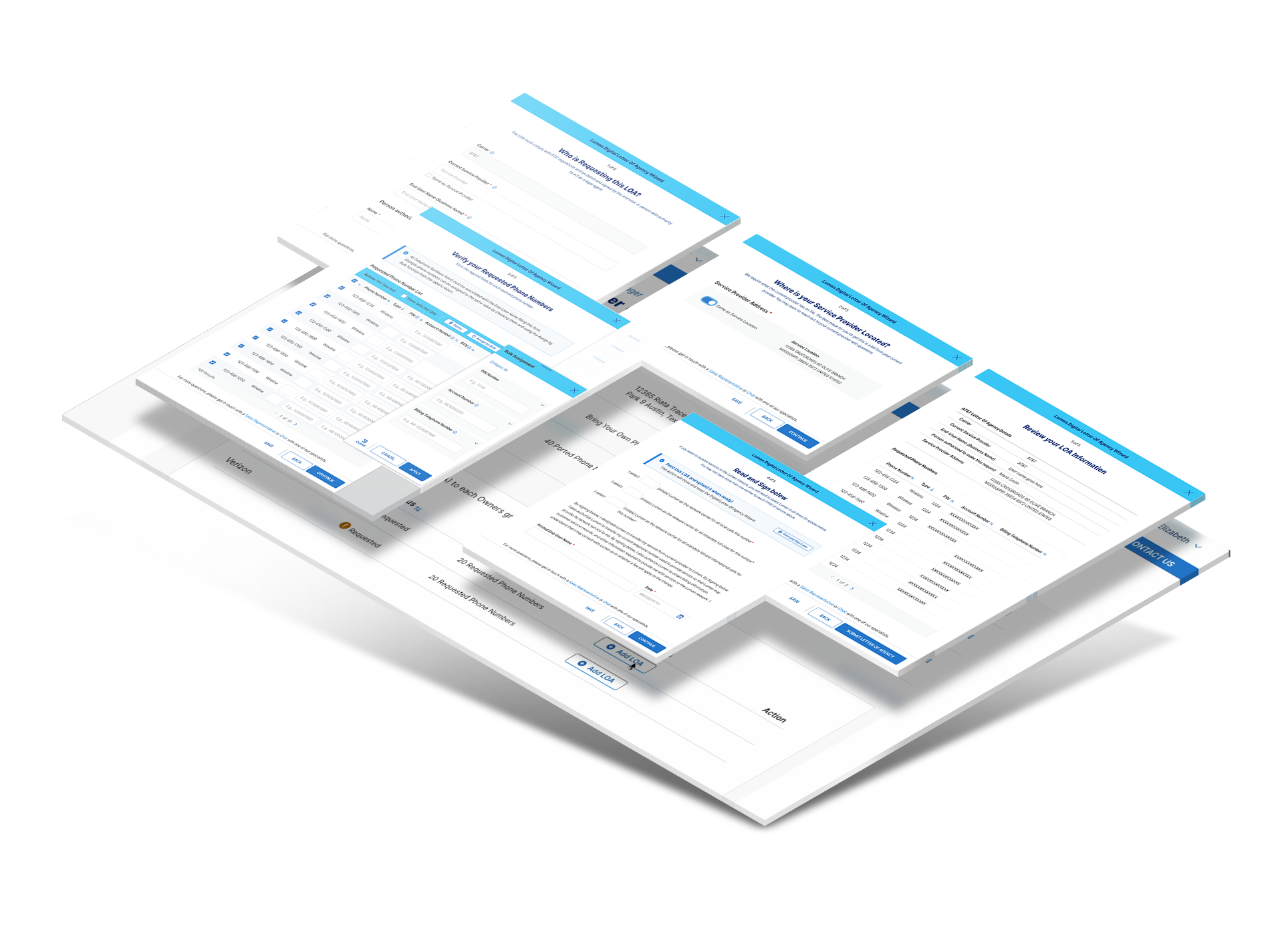
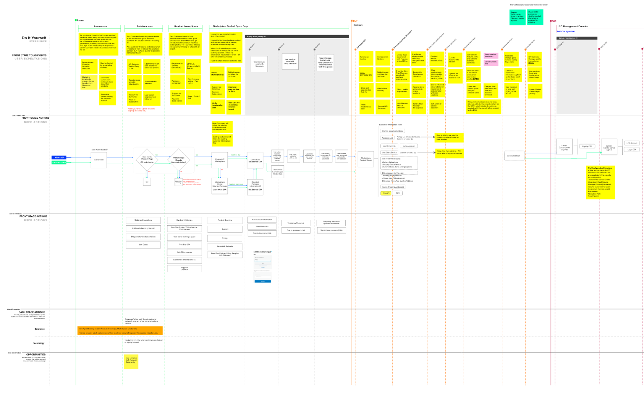
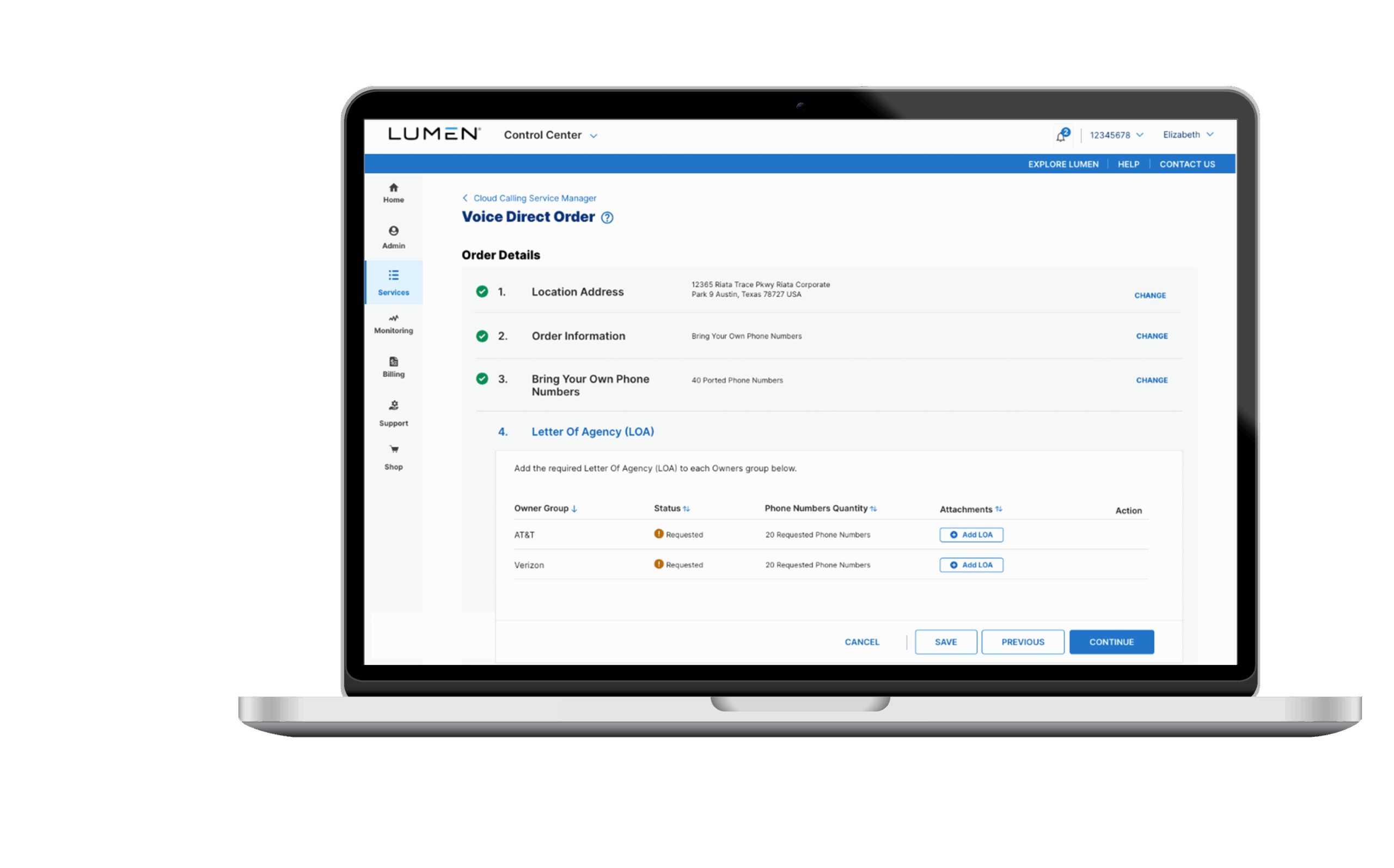
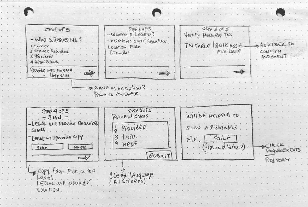
Thank you most sincerely for getting together and quickly working on the experience, wireframe, and product requirements to help us start PI 13 on the right foot for our dev team.Your collaboration is an example of how we can get ahead by helping each other. THANK YOU!
Testimonial Avatar
Castro, Mariela
International Solution & Architect Mgmt