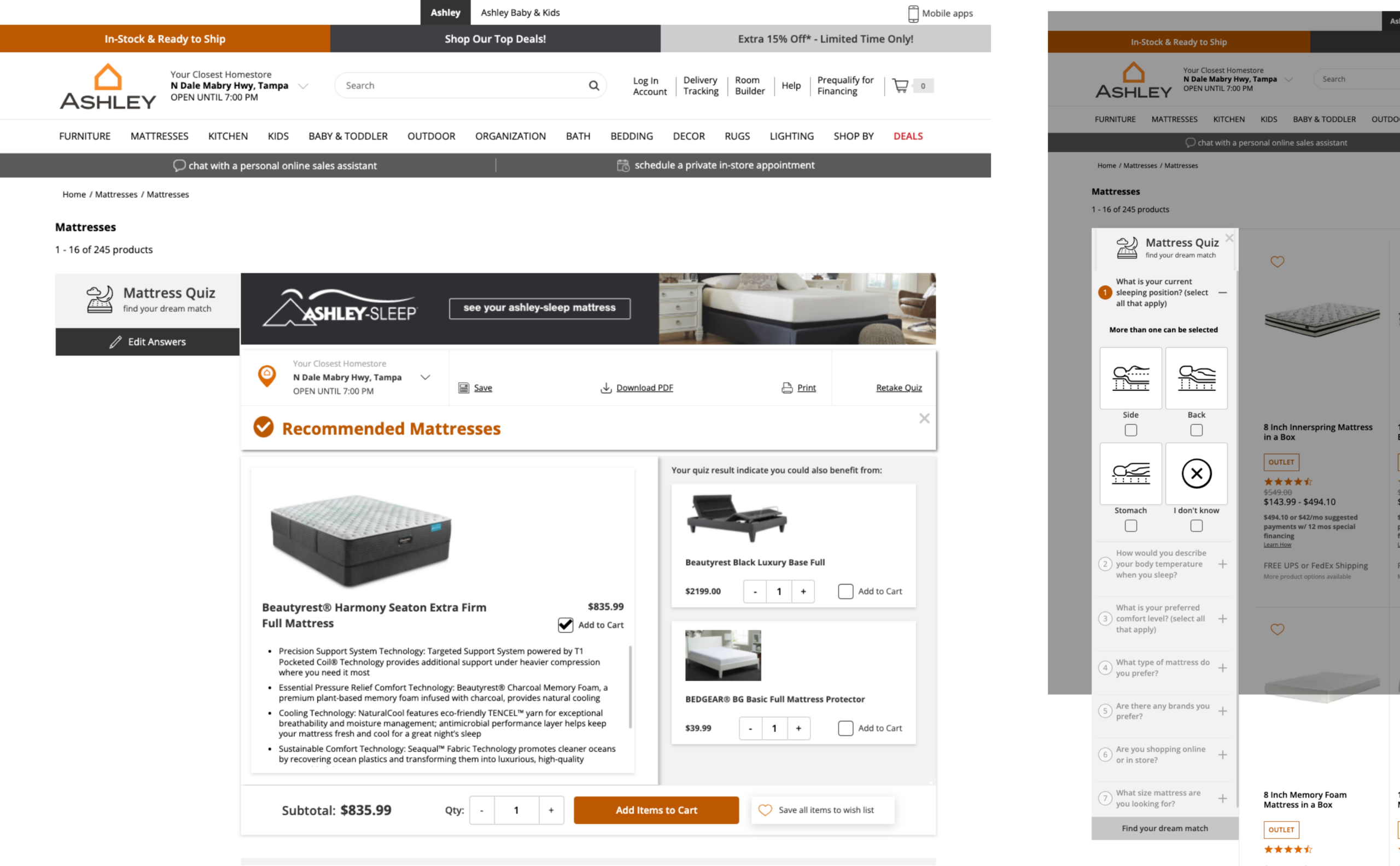
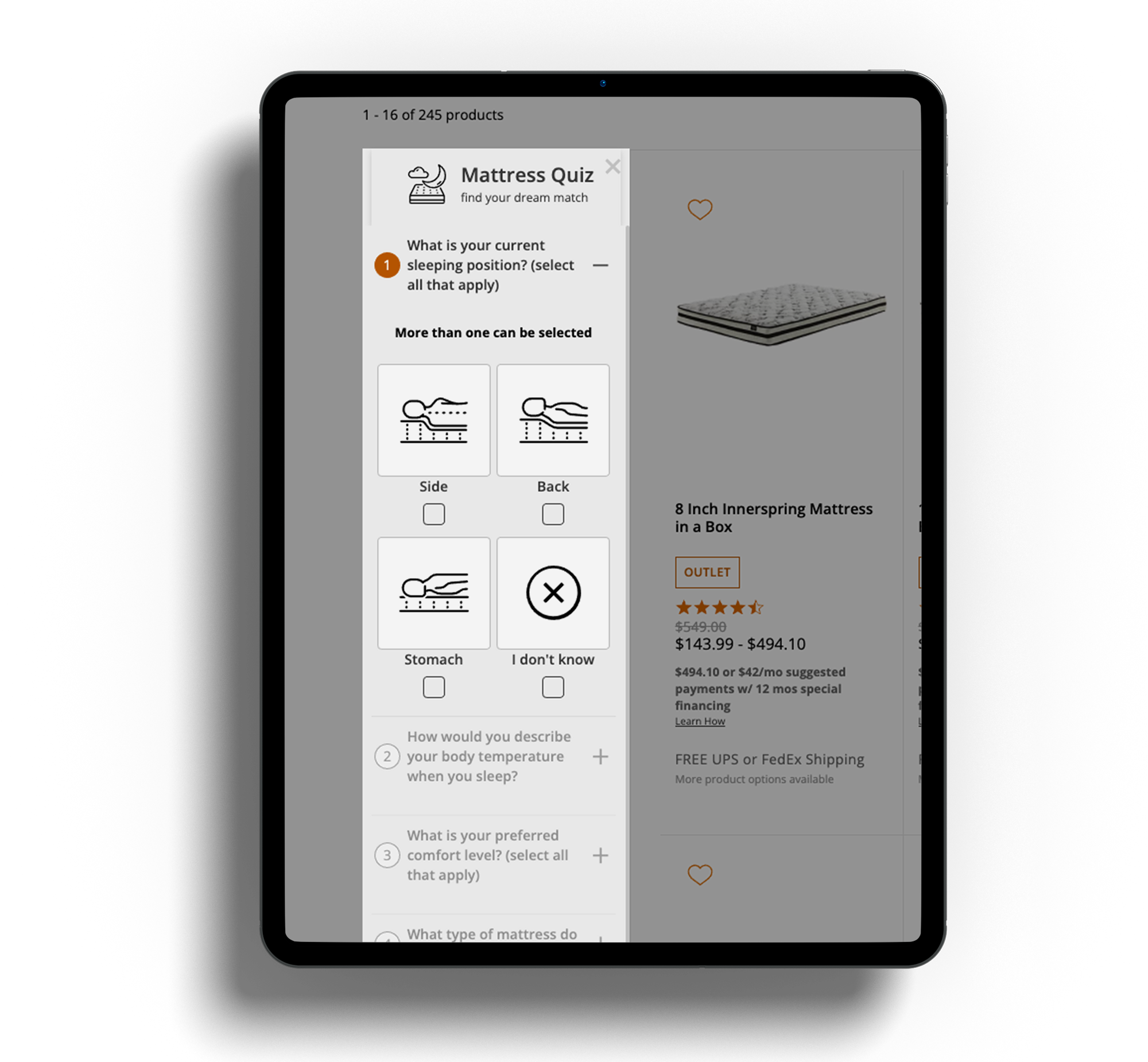
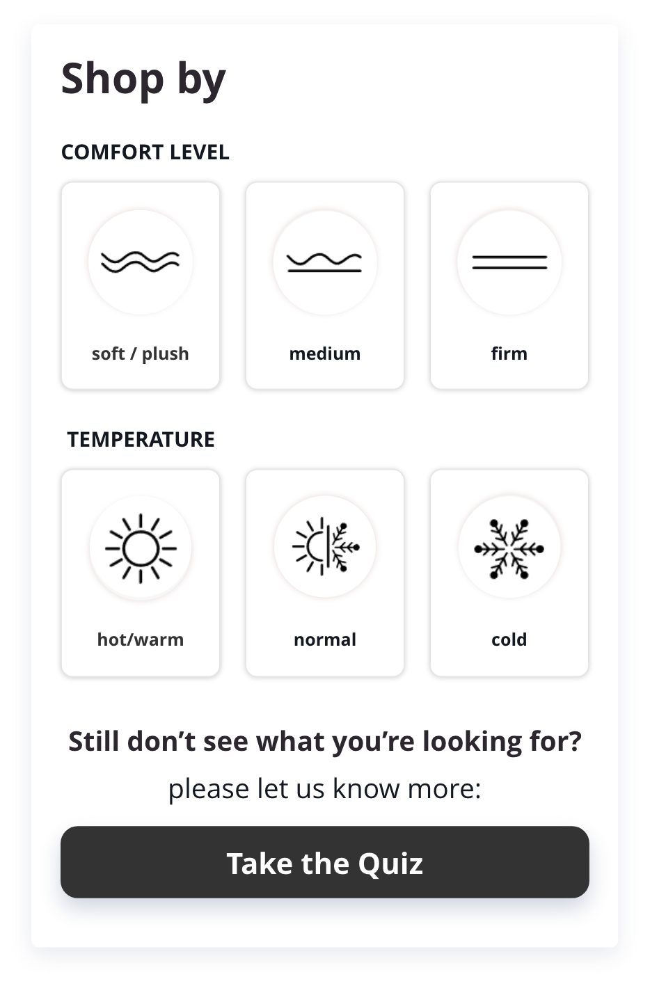
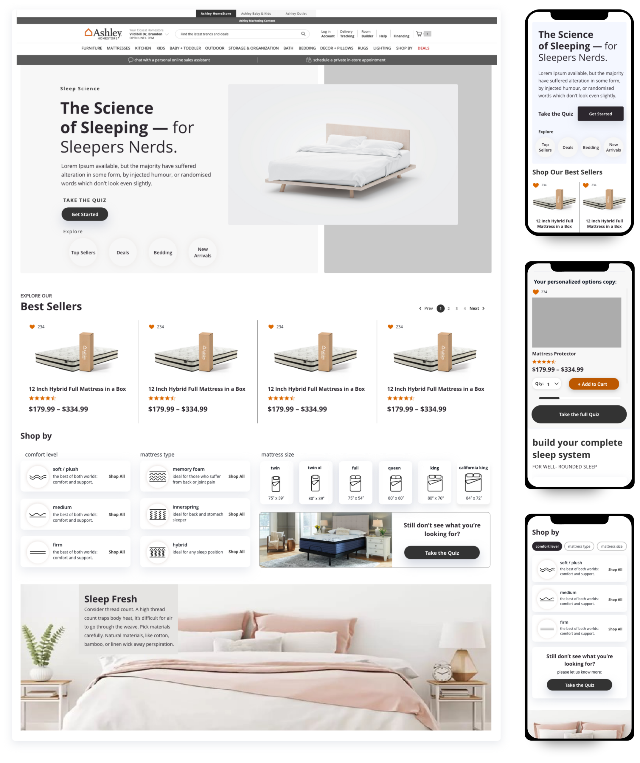
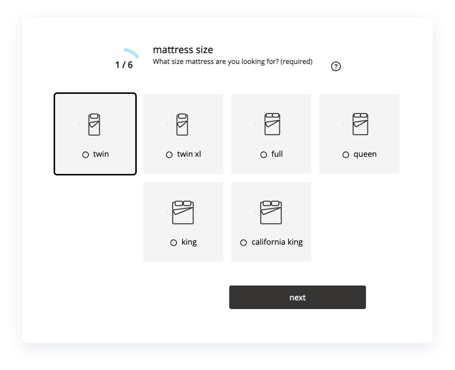
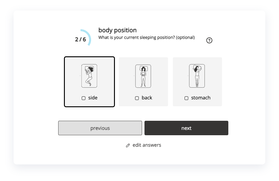
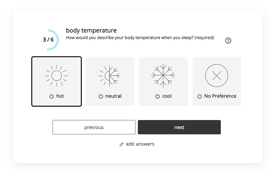
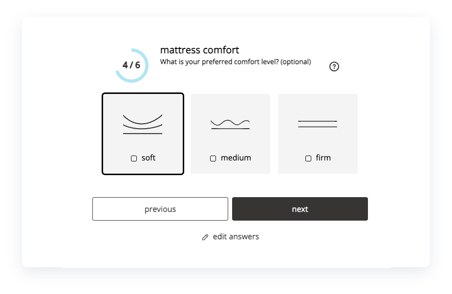
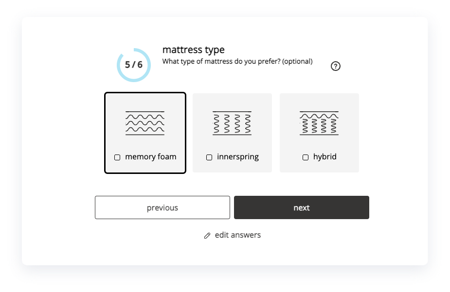
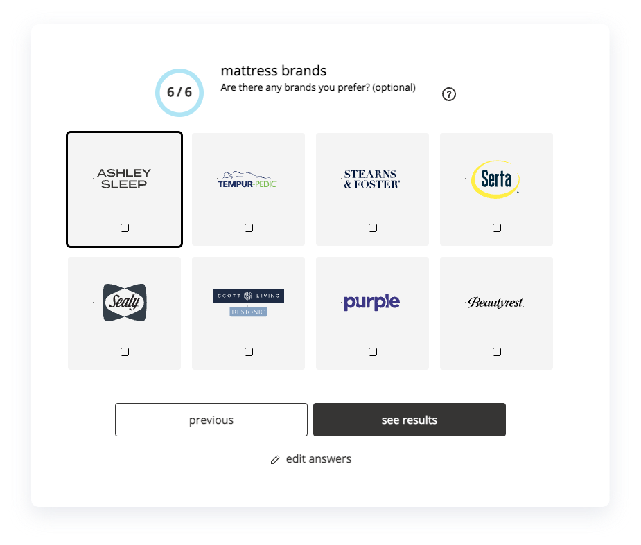
LOADING, PLEASE WAIT..

Ashley Furniture – Sleep Shop

Built a guided mattress discovery experience that delivers trustworthy recommendations across brands—fast to understand and easy to act on, especially on mobile.

Role Lead UX/UI

Team PM, ENG, Research, Stakeholders

Constraints Legacy system, time pressure, compliance, tech limitations

Improvements delivered Turned “browse mattresses” into a guided discovery path (Sleep Shop → Quiz → Recommendations) Rebuilt the experience mobile-first to reduce friction and increase completion Strengthened recommendation credibility with clearer logic, reassurance, and scannable PDP decision support

Outcome Conversion: +4.63 (%) Average Order Value: +1.55 (.1 scale) A guided discovery experience designed to move users from uncertainty → clarity → confidence

The Problem

Buying a mattress online is high-friction. Users feel uncertain, overwhelmed, and skeptical of recommendations—especially on mobile.

Goals

  • Reduce choice paralysis and wandering.
  • Help users feel the recommendation is earned (not sales-driven).
  • Improve completion and purchase confidence across the journey.

New guided journey

Sleep Shop introduces the promise → Quiz captures needs → Results deliver matches → PDP confirms decision.

Mobile-first quiz designed for completion: one decision per step, clear progress, and human-readable inputs.

Every question is intentional—and every recommendation can be explained.

PDP improvements

Restructured hierarchy to make decision cues scannable above the fold on mobile.

Mattress Quiz (before)

The previous quiz experience felt long and repetitive, which increased drop-off. We streamlined the flow to reduce effort and improve completion—especially on mobile.

Mattress Quiz (after)

We kept the Sleep Shop and Mattress Quiz highly accessible from key site entry points to drive visibility and reduce time-to-guidance. Reduced repetition and effort to improve completion and lower drop-off.

Ashley Sleep (before)

Ashley Sleep (after)

Defining the journey and key improvements

Clear “start here” framing to reduce bounce and wandering. Stronger value proposition: why this tool helps (trust + fit). Mobile-first layout with scannable modules and fewer competing actions.

– We designed the experience to feel like guidance, not persuasion.

– Modules have been created to identify cross-selling opportunities and enhance the shopping experience.

Modular system design

Built a component-driven layout so content stays readable, scannable, and consistent across breakpoints.

Research showed that 63%+ of users shop on mobile, so the experience was designed mobile-first from the start. We needed a modular system that could scale across templates while staying clean, consistent, and fast to implement.

Sleep Shop entry / landing: “A clear ‘start here’ entry point that moves users into guided discovery faster.”

Design system approach

In collaboration with Design + Engineering, we standardized grid and breakpoint usage and defined a repeatable handoff process.

We adopted an 8pt spacing system with:

  • 12 columns at 1440px
  • 4 columns at 360px
  • Responsive behavior between breakpoints for consistent rhythm and flexible layouts

I built reusable modules that reorganize smoothly across screen sizes—keeping the UI minimal and content scannable without sacrificing clarity or credibility.