Heuristic evaluation + UX strategy roadmap to reduce friction, prevent errors, and improve checkout confidence.
Covetrus supports task-focused B2B purchasing—users come in with intent, want speed, and need clarity to complete orders confidently.
- ROLE: Lead UX Designer — audit planning, heuristic evaluation, synthesis, and UX recommendations across the end-to-end purchase journey.
- SCOPE: Homepage → Search/PLP → Cart → Cart Right Rail→ Secure Checkout
- USERS: Veterinary practice staff + internal reps using Assisted Service Mode
- METHODS: Heuristic evaluation, task walkthroughs, edge-case review (large carts, restricted items)
- DELIVERABLES: Findings, prioritized recommendations, UX patterns for rapid iteration
Context and challenge
Covetrus’ e-commerce experience is built for repeat, efficiency-driven purchasing. In environments like this, small UI and flow disruptions create outsized impact—slowing users down, increasing errors, and eroding trust at critical commitment moments (shipping, payment, final review). This audit focused on reducing friction in product discovery, cart building, and checkout completion—especially where unclear information hierarchy, missing affordances, or disruptive UI patterns can lead to abandonment or support burden.
Goals
– Make key information scannable (price, availability, totals, delivery, discounts)
– Reduce interaction cost (fewer interruptions, clearer progression, fewer unnecessary steps)
– Prevent errors (predictable controls, strong validation, helpful inline guidance)
– Increase confidence at commitment moments (shipping, payment, review, place order)
Methodology & approach
This audit combined three inputs to ensure recommendations were both usable and realistic to deliver:
1. Customer + eCommerce trends
A quick review of modern ecommerce expectations and how they influence abandonment, trust, and completion behavior.
2. Heuristic evaluation & UX review
A structured evaluation across the journey using usability principles (clarity, feedback, consistency, error prevention, and efficiency).
3. Competitive + comparative audit
A comparison against patterns that users already understand from best-in-class ecommerce experiences—used to spot gaps and opportunities.
UX strategy framework
Findings and recommendations were organized into a simple strategy model to help teams decide what to fix first:
– MVP improvements (high-impact, low/medium effort fixes that reduce friction fast)
– System-level refinements (consistency and scalability across templates/components)
– Future-state experience (larger shifts in IA, interaction patterns, and checkout architecture)
Key findings by journey stage
This audit combined three inputs to ensure recommendations were both usable and realistic to deliver:
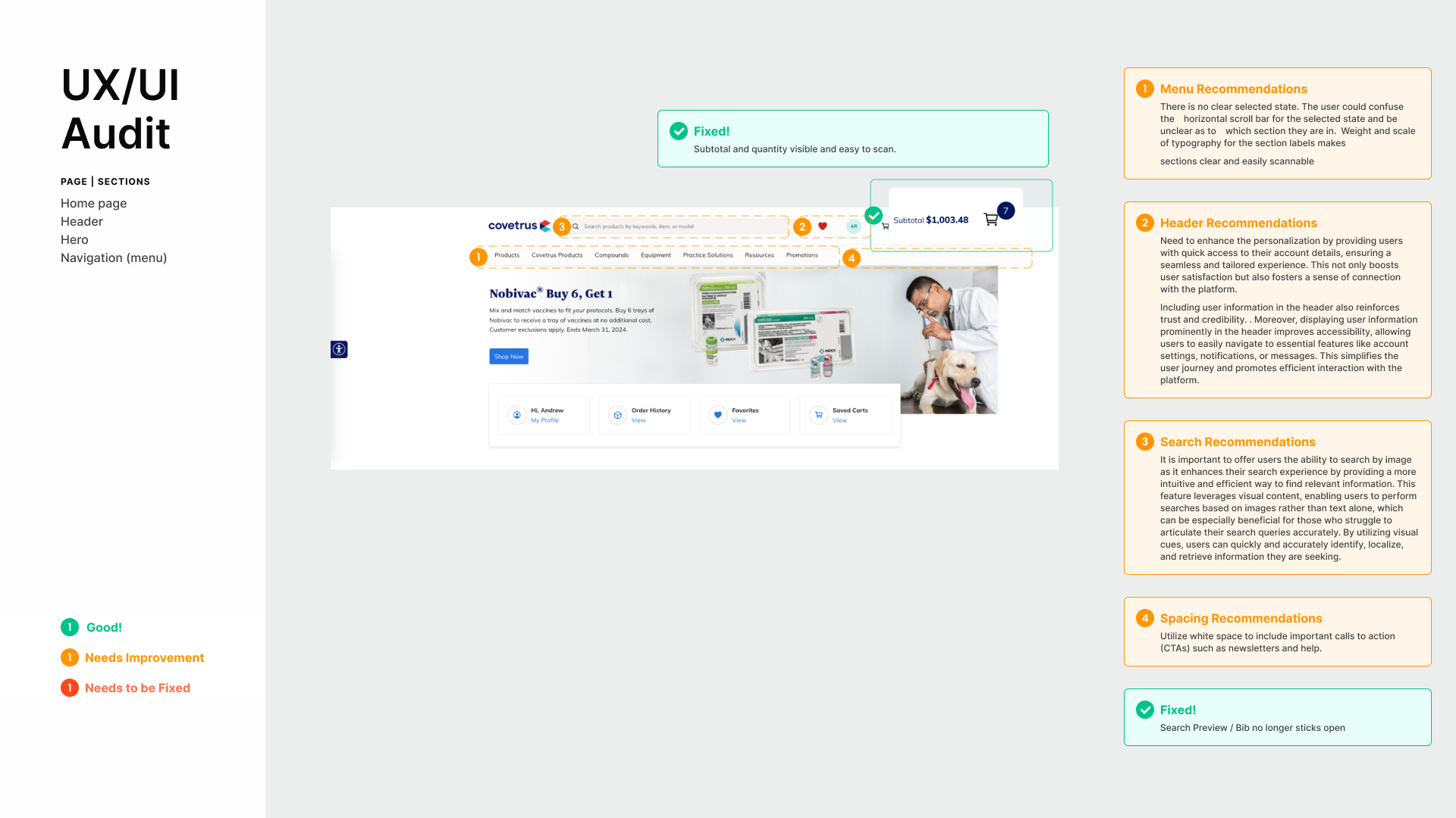
1. Discovery & navigation (Homepage + PLP)
Theme: Reduce friction in browsing and make lists scannable without hidden effort.
– Reduce navigation friction: avoid menus that require scrolling or category expansion; make active states clear
– Improve product list scannability: ensure primary actions and counters are visible without hover; strengthen typographic hierarchy
– Strengthen catalog utility: add comparison support and improve filtering for spec-driven browsing; support search-within-filters for long facet lists
Why it matters: In task-focused B2B purchase flows, discovery isn’t “exploration”—it’s locating quickly and moving forward. Any friction here slows the full funnel
2. Consideration (PDP)
Theme: Put the essentials where decision-making happens.
– Use the right rail to surface essentials: price, availability, promotions, and a clear add-to-cart block
– Improve accessibility and hierarchy: contrast, labeling clarity, rating and promotion readability
– Reduce accordion overload: use more skimmable structures when appropriate (tabs or clear sectioning)
Why it matters: When PDPs bury critical info, users hesitate, double-check, or abandon—especially when availability and price rules are complex.
3. Cart management (Cart + Right Rail)
Theme: Long carts need management tools—not just a list.
– Enable batch actions: multi-select, bulk remove/save, cart-level filtering for large carts
– Improve readability: separate availability, delivery, price, discounts with clearer hierarchy and spacing
– Reduce disruption: avoid auto-opening the right rail on every add/remove; use calmer feedback patterns
Why it matters: B2B carts tend to be large and repetitive. If managing cart changes is painful, users delay checkout or create errors that cascade into support.
4. Checkout completion (Secure Checkout)
Theme: Make progress predictable, keep totals visible, and prevent errors in forms.
– Use a stepper model that keeps users focused while still allowing edits within checkout (avoid forced return to cart)
– Keep order summary + per-item totals visible while scrolling (especially desktop)
– Reduce form effort: smart defaults, “billing = shipping,” and clear errors near the field
– Clarify payment selection states; if there’s only one method, preselect to avoid confusion
Why it matters: This is where users decide whether the experience is “safe.” Confusion here = abandonment, rework, or support tickets.

Quick wins already delivered
The audit also captured UX/UI/CX “winnings” already shipped or in progress—helping build momentum while larger redesigns are evaluated. Examples include improvements across login messaging, product availability visibility, pricing clarity, checkout payment defaults, and cart drawer behaviors.
Recommended roadmap
Phase 1 — MVP friction reducers
Make totals/summary visibility persistent during checkout Improve error handling and field validation clarity Reduce disruptive overlays/drawers that interrupt task flow Strengthen hierarchy for price, availability, promotions across templates
Phase 2 — Consistency & scalability
Standardize cart and PDP information architecture Improve template consistency across PLP/PDP/cart/checkout components Introduce better cart management patterns for large carts (batch actions)
Phase 3 — Future state
Evolve checkout architecture to a cleaner stepper + edit-in-place model Design a more robust catalog utility layer (comparison + filter search + better scannability)
How success would be measured
– Checkout completion rate + drop-off by stepturn to cart)
– Form error rate + time-to-complete checkout
– Cart edits per session (and time cost of those edits)
– Support tickets tied to payment, address, and promotions
Sources referenced: Nielsen Norman Group + Baymard Institute