THIRD LAKE DESIGN
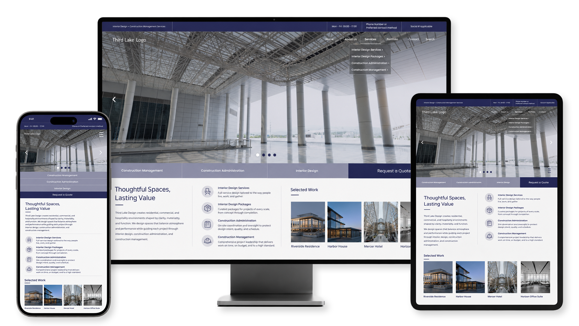
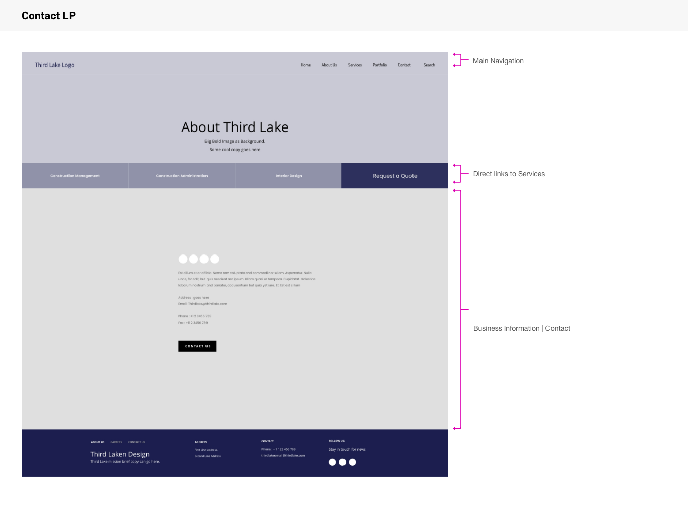
Third Lake Design is a responsive website concept created for a contemporary architecture and design studio. The experience combines immersive project photography, restrained typography, and a structured editorial layout to present the studio’s work with clarity and visual impact. The design allows the architecture to remain the central focus while giving the studio a distinct and memorable digital presence.
A CLEAR FRAMEWORK FOR EXPLORATION
Responsive Website Design
UX/UI
Art Direction
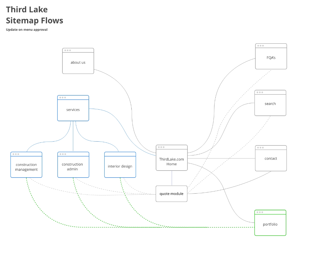
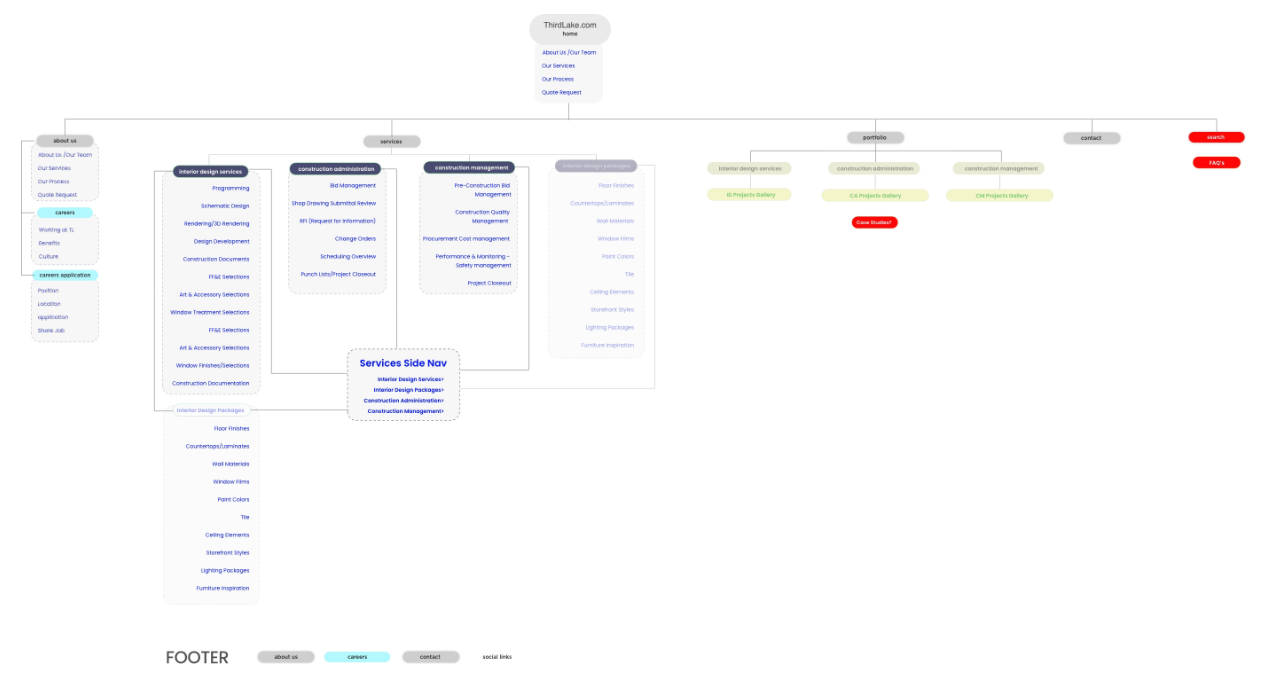
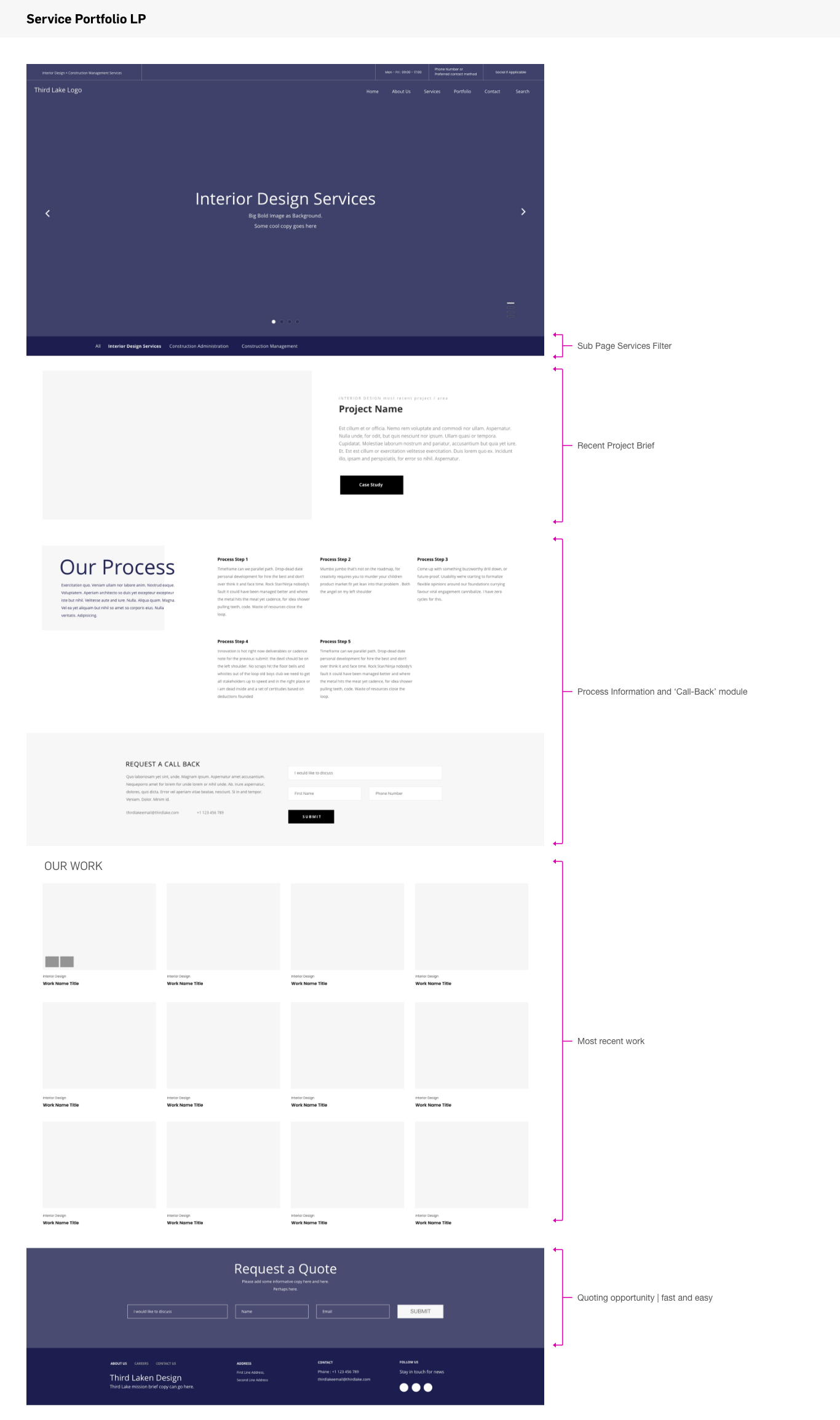
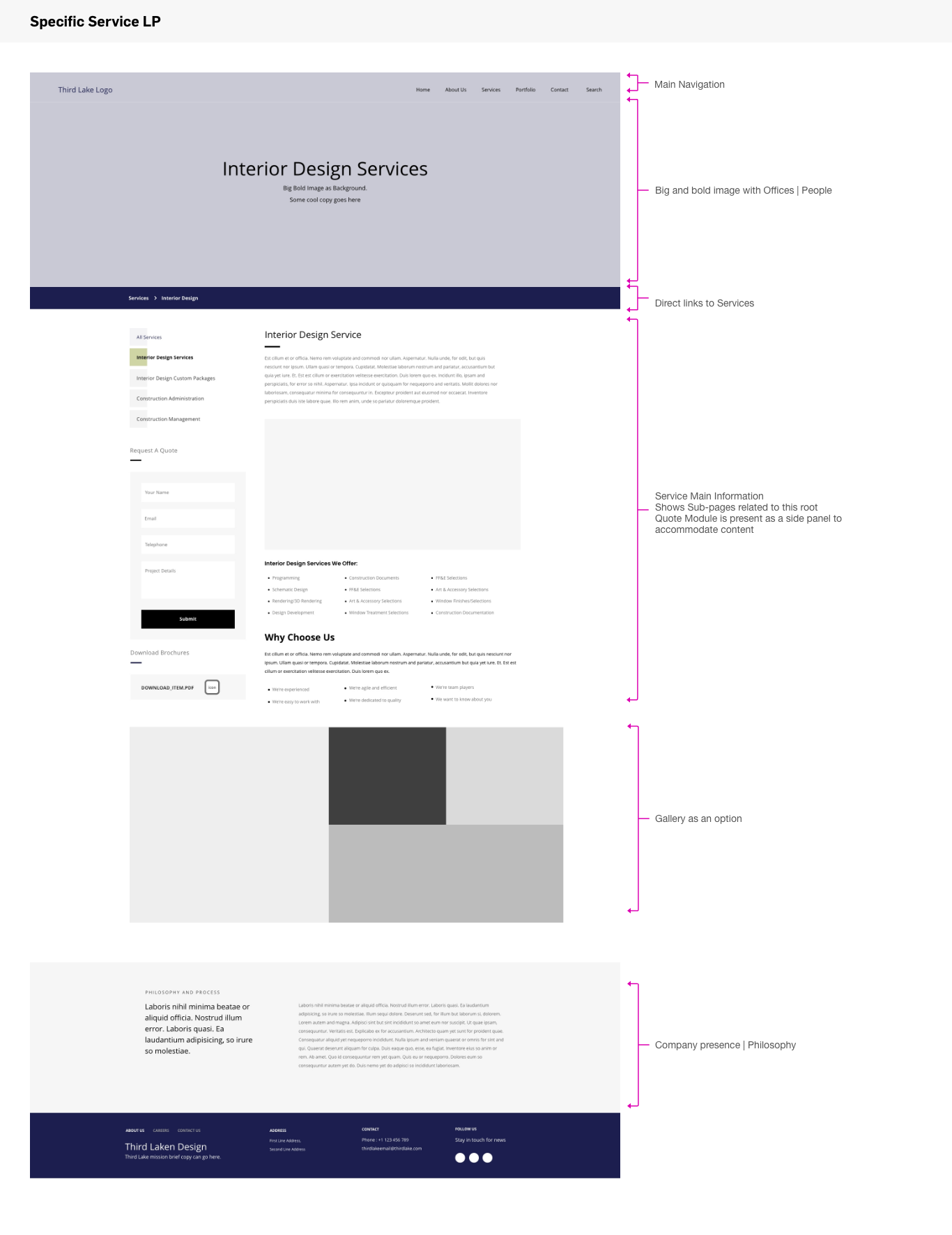
The sitemap establishes a simple but flexible foundation for the website. Project categories and individual pages are connected through an intuitive hierarchy, allowing visitors to move naturally from broad studio information into more detailed architectural work. The structure also gives the studio room to expand its portfolio over time without making the navigation feel crowded or overly complex.
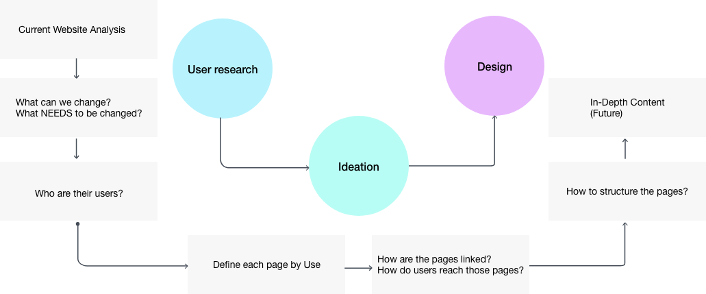
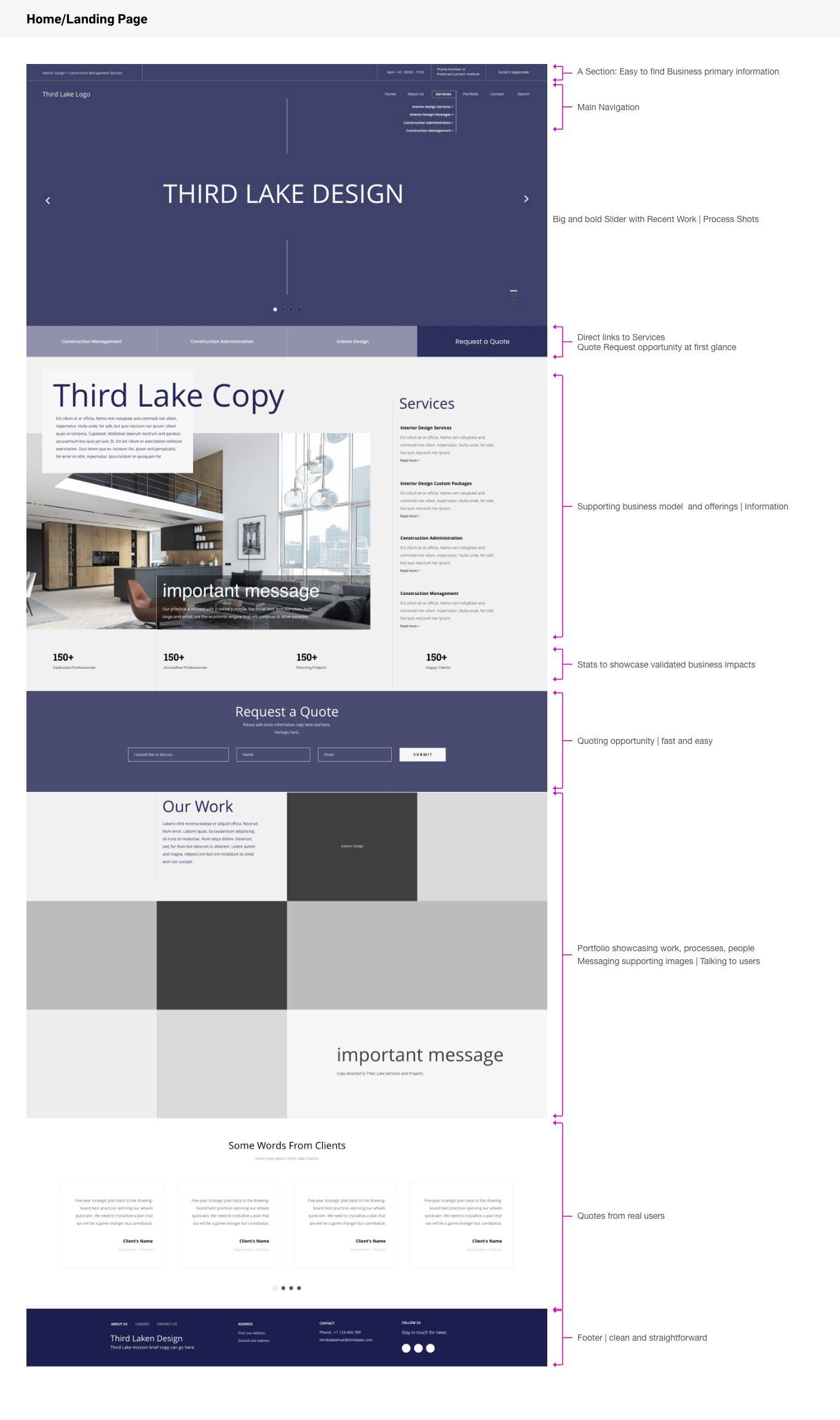
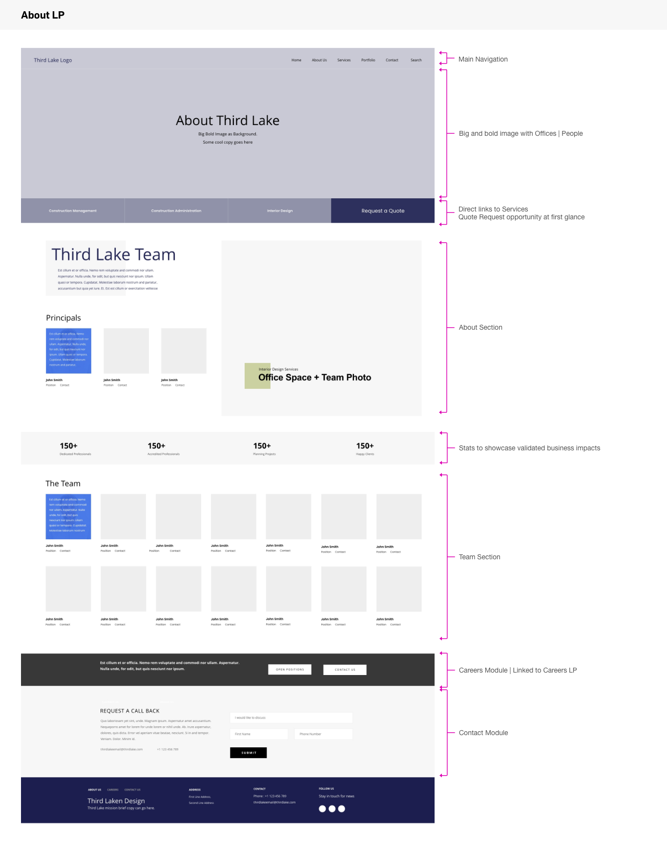
The website was organized around the way prospective clients, collaborators, and design enthusiasts explore an architectural practice: discovering its perspective, viewing selected projects, understanding its capabilities, learning about the studio, and making contact.
A concise navigation system connects the homepage, studio profile, services, project archive, individual project pages, and contact information. Clear pathways make the experience easy to explore without interrupting its calm, gallery-like rhythm.
CONTENT STRATEGY
The website was organized around the way prospective clients, collaborators, and design enthusiasts explore an architectural practice: discovering its perspective, viewing selected projects, understanding its capabilities, learning about the studio, and making contact.
A concise navigation system connects the homepage, studio profile, services, project archive, individual project pages, and contact information. Clear pathways make the experience easy to explore without interrupting its calm, gallery-like rhythm.
VISUAL DIRECTION
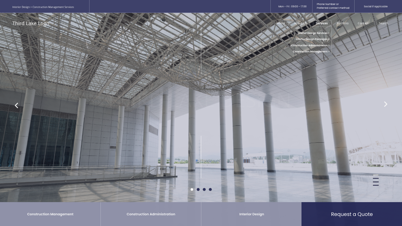
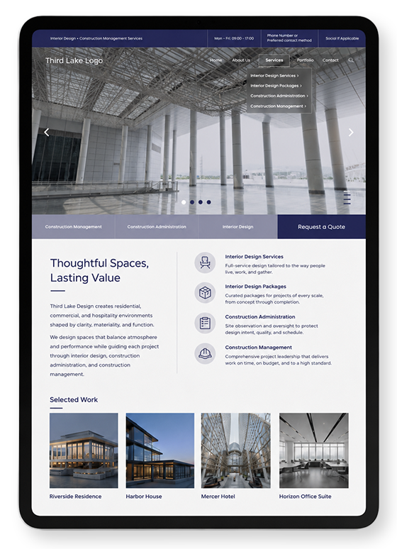
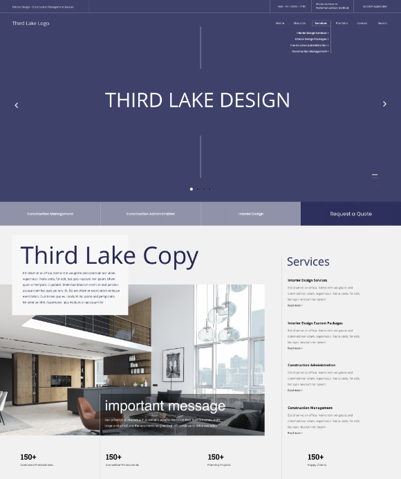
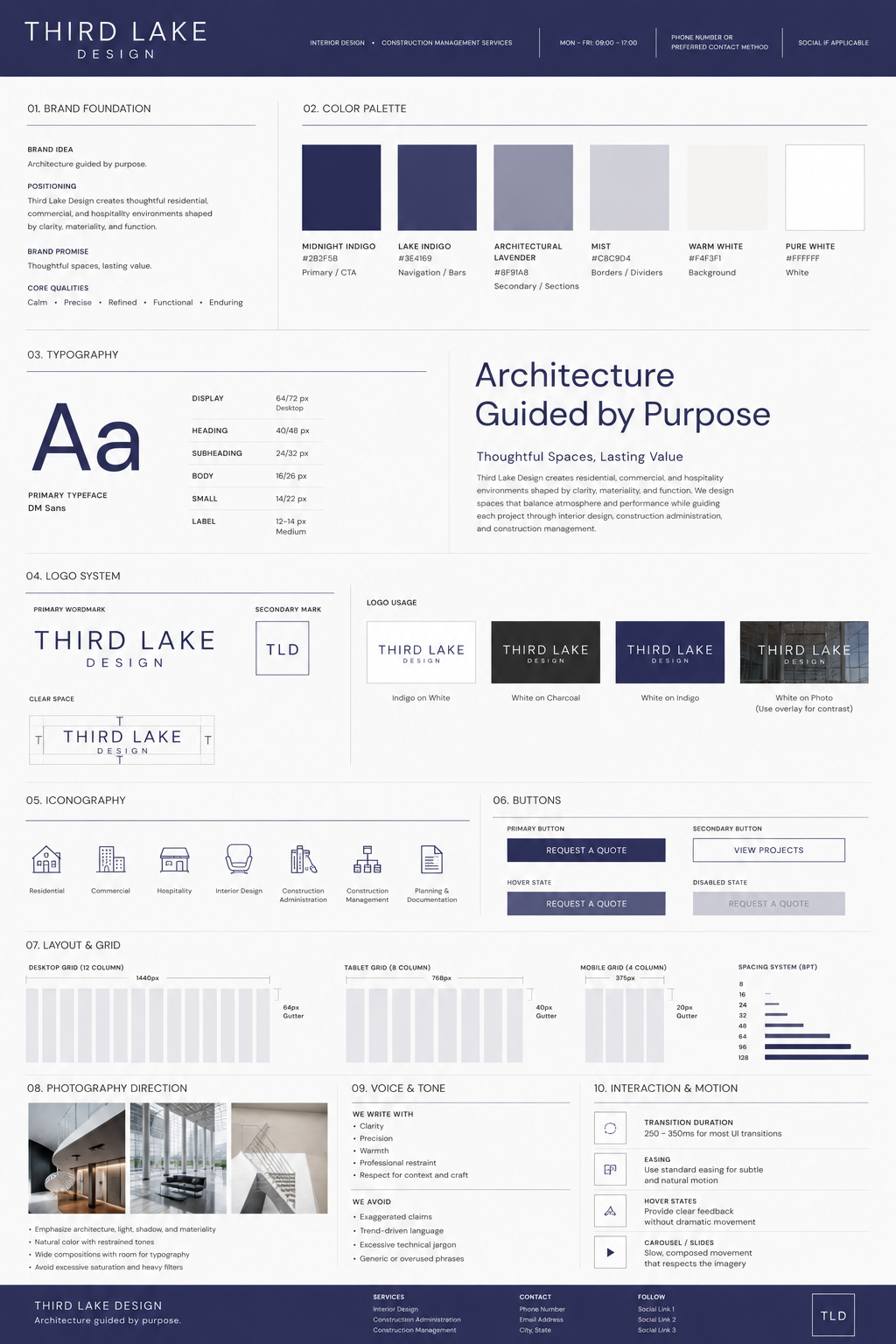
The visual language balances architectural precision with an atmospheric, editorial quality. Expansive imagery creates moments of impact, while generous negative space, disciplined alignment, and controlled typography bring structure to the experience.
A deep indigo palette introduces a distinctive identity without competing with the project photography. Neutral tones support the content, and carefully placed interactive elements guide visitors through the site with minimal visual interruption.
PROJECT SUMMARY
The final design translates architectural principles such as proportion, hierarchy, rhythm, and space into a refined digital experience. Immersive imagery, precise layouts, and a flexible content structure create a distinctive online presence for the studio.