
Turning fragmented B2B workflows into a scalable commerce experience
A UX audit and strategic design initiative focused on simplifying high-frequency ordering, clarifying complex promotions, and establishing more consistent interaction patterns across Covetrus’ veterinary commerce platform.
UX Strategy · Experience Audit · B2B eCommerce · Interaction Design · Responsive Systems
COMPLEX ECOSYSTEM
Multiple workflows across ordering, promotions, AutoShip, billing, and account management.
FREQUENT TASKS
Veterinary teams rely on the platform to complete time-sensitive tasks. Repeat purchasing tasks.
INCONSISTENT EXPERIENCE
Similar actions behave differently across pages, devices, and commerce entry points.
THE OPPORTUNITY
Identify systemic gaps and create a more coherent, scalable commerce experience.
Project Overview
- ROLE: UX Designer
- TEAM: Product Manager, Developers, Analytics Partners, and Business Stakeholders
- SCOPE: UX audit, research synthesis, heuristic evaluation, opportunity prioritization, interaction design, responsive design, component exploration, roadmap development, success-metric definition, and stakeholder alignment
Impact
- Prioritized five high-value UX initiatives across core B2B commerce workflows
- Established a phased roadmap balancing user impact, business value, and implementation effort
- Defined reusable patterns for Add to Cart, quantity selection, product variants, promotions, and Right Rails
- Created a strategic direction for repeat ordering and account-management experiences
- Developed a measurement framework for evaluating ordering efficiency, promotion engagement, and task success
UX STRATEGY FRAMEWORK
Designed around speed, clarity, consistency, and scale
The strategy was organized around four experience principles.
Accelerate frequent actions
Repeat customers should be able to add, adjust, reorder, and continue without unnecessary navigation or repeated decisions
Clarify decisions in context
Product variants, savings, promotions, and eligibility requirements should appear when they are relevant to the user's current task.
Standardize interaction patterns
Similar actions should behave consistently across product lists, Product Detail Pages, Quick Views, Carts, Dashboards, and Account.
Build for continued growth
Components and modules should adapt to changing business needs without requiring the entire experience to be redesigned.
WHAT THE AUDIT REVEALED
Different screens were producing the same underlying friction
The audit became evidence for a system-level diagnosis - not a gallery of internal slides.

ORDERING FRICTION
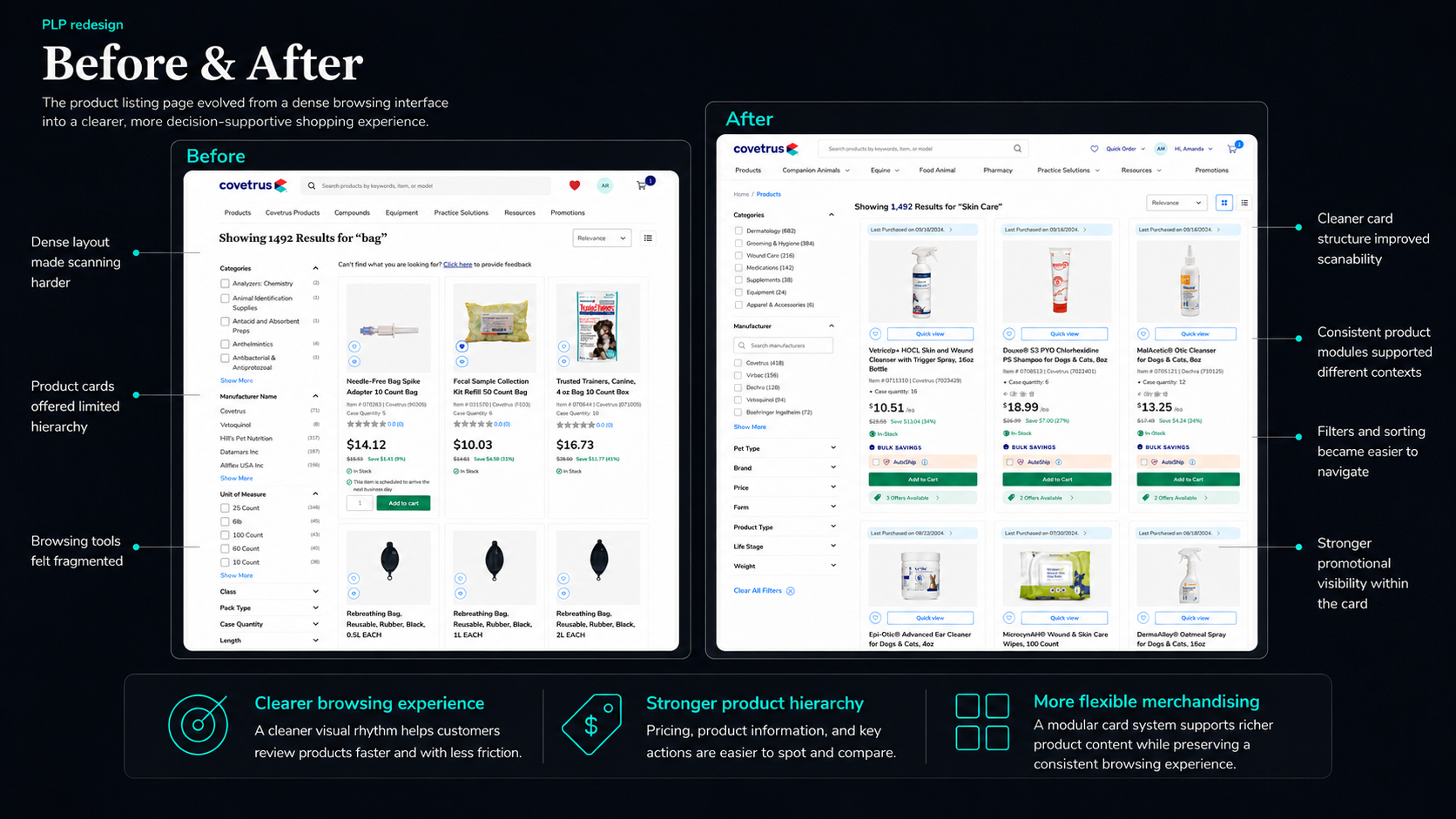
Inconsistent Add to Cart and quantity patterns slowed frequent purchasing. Quantity exposed before commitment. The Ad to Cart module was only visible when the user hover the item card.

REPETITIVE SELECTION SOLUTIONING
Users ordering several variants had to repeat the same workflow.

PROMOTION AMBIGUITY
Offer eligibility, thresholds, and conflicts were difficult to understand.

FRAGMENTED TASKS
Frequent administrative and purchasing tasks were distributed across separate destinations. Proposed solution — Centralized Account Tasks
PRIORITIZING THE
Balancing immediate value with long-term transformation
Findings were evaluated by frequency, severity, user value, business relevance, cross-platform impact, and implementation effort.
FIVE PRIORITY INITIATIVES
CTA and quantity standardization:
Create a consistent purchasing pattern across key entry points.
Multi-variant ordering:
Reduce repetitive selection for sizes, strengths, and formulations.
Promotion visibility and eligibility:
Clarify applied offers, thresholds, and conflicts.
Account Manager experience:
Centralize recurring administrative and purchasing tasks.
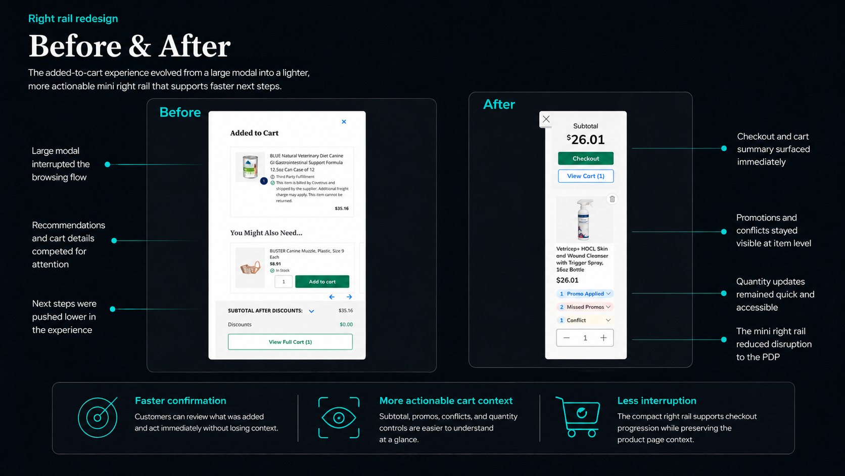
Right Rail standardization:
Create predictable contextual actions and sticky primary controls.
SOLUTION STORY 1 - FASTER ORDERING
Standardizing high-frequency purchase interactions
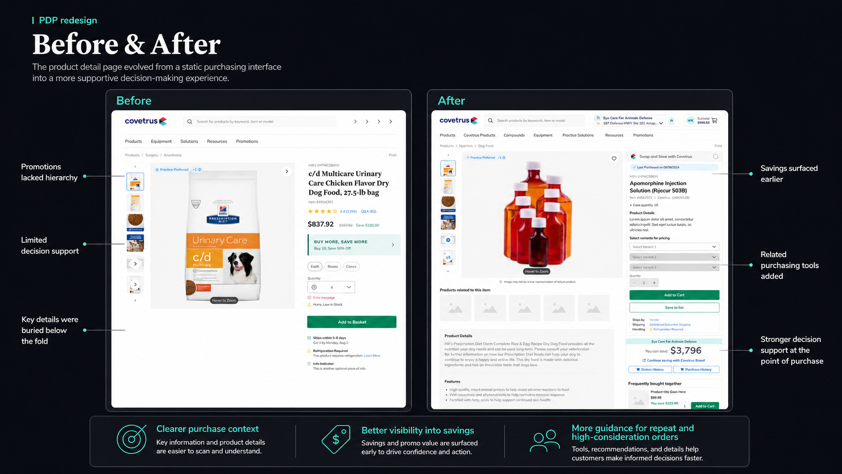
CTA and quantity standardization was the strongest immediate opportunity because it affected nearly every product entry point.
1. ADD: Keep shopping or proceed without losing context.
2. CONFIRM: Provide immediate feedback without leaving the task.
3. ADJUST: Reveal quantity controls only when relevant.
4. CONTINUE: Keep shopping or proceed without losing context.
SOLUTION STORY 2 - CLEARER SAVINGS AND PROMOTIONS
Turning complex offer logic into actionable decision support
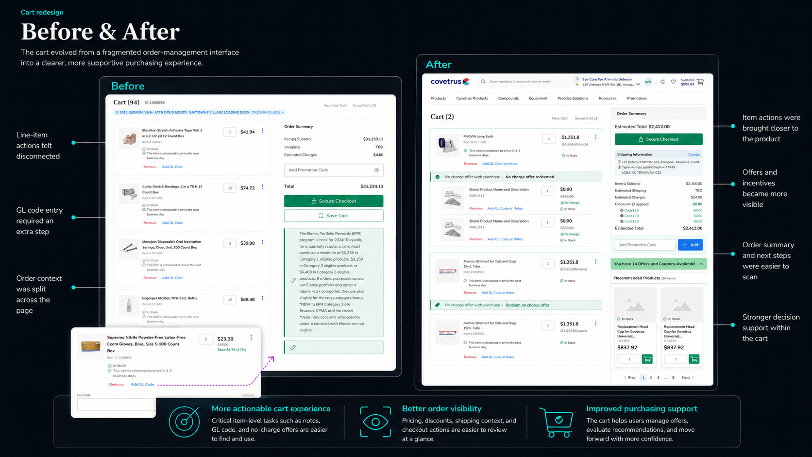
Rebates, free gifts, AutoShip discounts, contract pricing, and bulk offers needed to become understandable at the moment of decision.
Promotion Logic
- Contextual promotion indicators
- Eligibility and threshold messaging
- Applied, missed, and conflicting offer summaries
- Clear explanations when offers cannot be combined
SAVINGS DASHBOARD
Turning savings insights into product action
The dashboard connected estimated and realized savings directly to relevant products and purchasing actions - turning a static report into active decision support.
SOLUTION STORY 3 - CENTRALIZED ACCOUNT TASKS
Creating a more coherent administrative experience
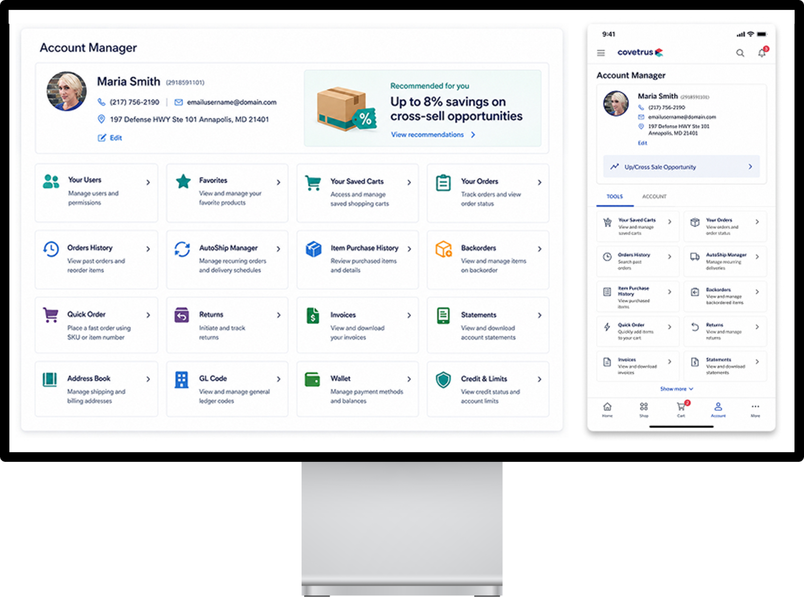
Saved carts, order history, AutoShip, invoices, statements, returns, and user administration were distributed across separate destinations.
ACCOUNT MANAGER
A centralized environment brought frequent administrative and purchasing tasks into one starting point.
- Faster task completion
- Greater self-service confidence
- Reduced support dependency
- Better continuity for repeat ordering
SCALING THE SYSTEM
Savings and account experiences were explored as modular systems rather than fixed page compositions.
The savings and account dashboards were explored as modular systems rather than fixed page compositions. This approach allowed the experience to adapt according to user role, account behavior, screen size, and changing business priorities.
Role-Based Relevance
Modules can be prioritized according to the user’s responsibilities, purchasing history, and clinic activity
Progressive Expansion
Users begin with essential information and move into deeper detail only when needed.
Reusable Modules
Savings summaries, product opportunities, reports, account tools, promotions, and operational actions share a consistent structure.
Responsive Continuity
Modules reorganize across desktop, tablet, and mobile while preserving information hierarchy and access to primary tasks.
Future Scalability
New capabilities can be introduced as modules without requiring the entire dashboard to be redesigned.
EXPERIENCE INTENT
Fast flow, not rushed
Support frequent purchasing and administrative tasks without removing information required for confident decisions.
Guided, not directed
Present savings, alternatives, and recommendations as decision support rather than forced pathways.
Informed, not overwhelmed
Reveal complex pricing, variants, eligibility rules, and account information progressively and in context.
Consistent across workflows
Ensure users do not need to relearn familiar actions when moving between product lists, Quick Views, carts, dashboards, and account tools.
EXPERIENCE INTENT
IMMEDIATE
- CTA and quantity standardization
- Promotion clarity
- Stronger interaction feedback
MID-TERM
- Multi-variant ordering
- Right Rail standardization
- Reusable commerce components
STRATEGIC
- Account Manager experience
- Modular savings dashboard
- Role-based personalization
MEASURING SUCCESS
Ordering Efficiency
- Reduced time to Add to Cart
- Fewer interactions per completed order
- Faster quantity adjustment
- Increased completion of repeat-order tasks
Multi-Variant Purchasing
- Increased bulk-item cart additions
- Reduced exits during variant selection
- Higher completion rates for multi-SKU workflows
Promotion Comprehension
- Increased promotion-detail engagement
- Improved offer redemption
- Fewer promotion-related support requests
- Reduced abandonment related to eligibility confusion
ACCOUNT MANAGEMENT
Administrative task success • Use of self-service tools
PRODUCT DISCOVERY
Quick View/PDP abandonment • Movement from insight to product action
KEY TAKEAWAY
The greatest opportunity was not a single screen - it was a more coherent system
Small inconsistencies across high-frequency workflows created cumulative operational friction.
By translating audit findings into reusable interaction patterns and a phased roadmap, the work established a clearer path toward a faster, more understandable, and more scalable B2B commerce experience.