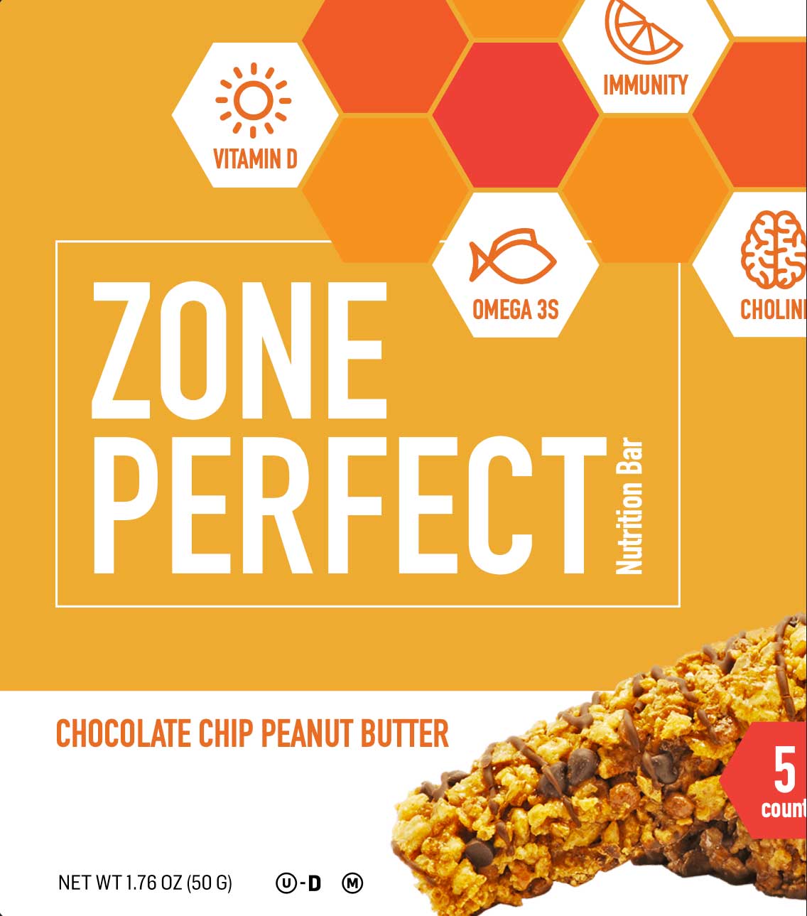
ZonePerfect — Packaging & Visual System Exploration
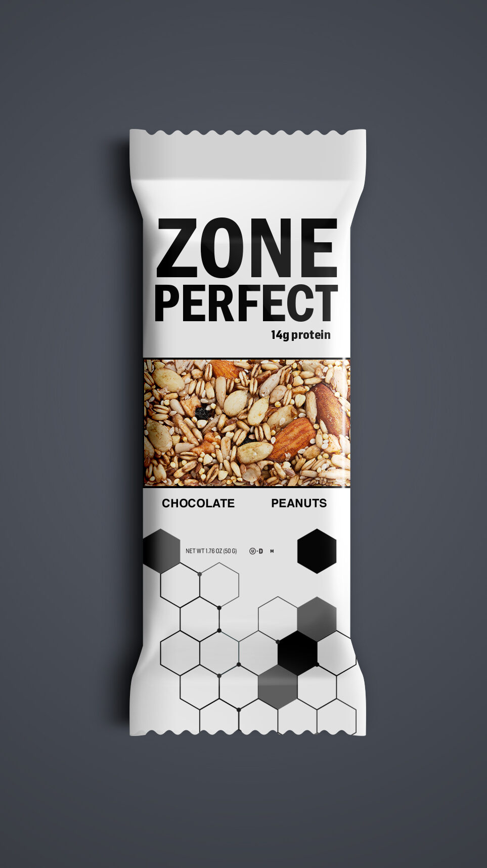
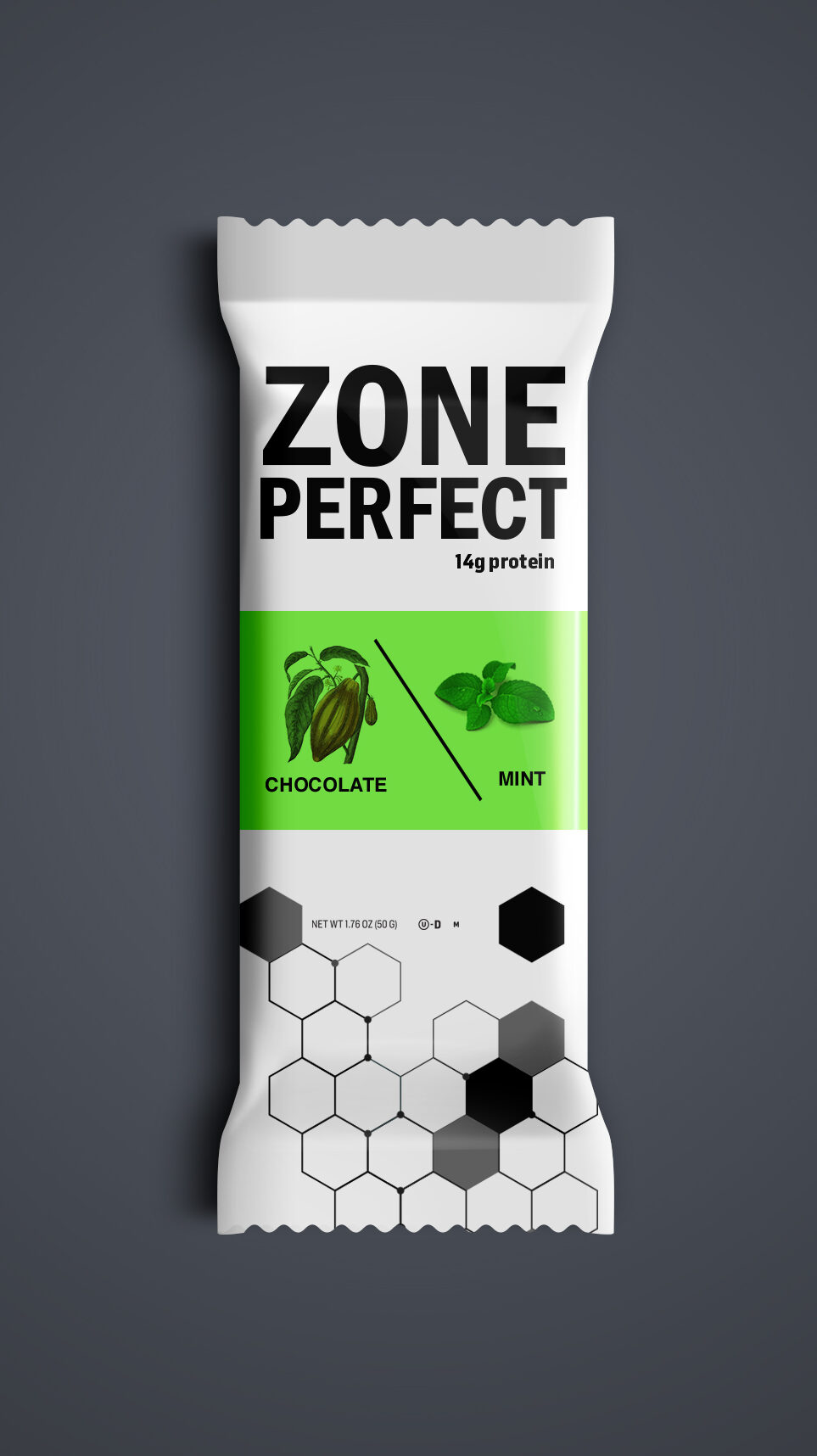
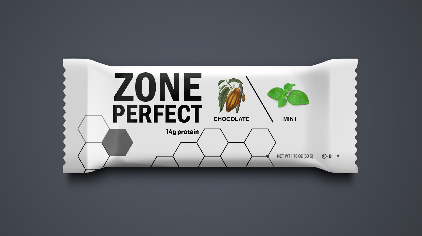
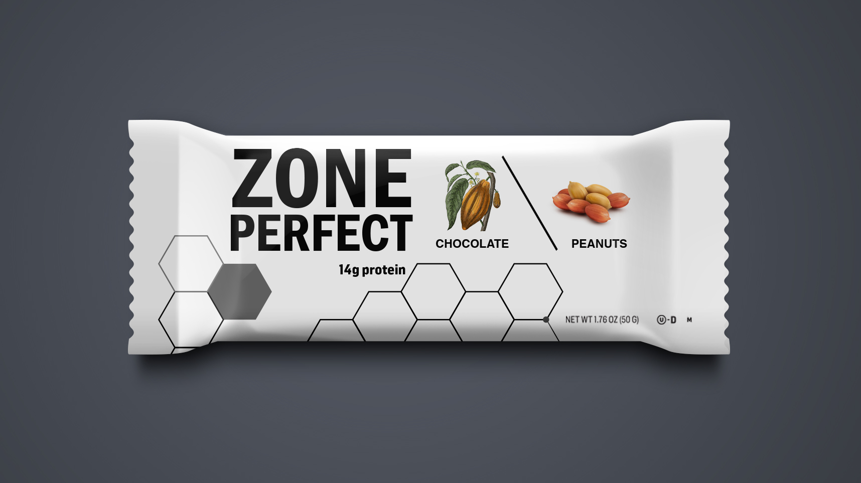
The exploration examined how typography, color, ingredient imagery, composition, and modular graphic systems could create a more distinctive and flexible expression across the product line.
- Packaging
- Art Direction
- Visual Systems
The Challenge
Create a packaging language that could balance nutrition, taste, and credibility while helping ZonePerfect stand apart in a highly competitive category. The system also needed enough flexibility to differentiate flavors without losing overall brand recognition.
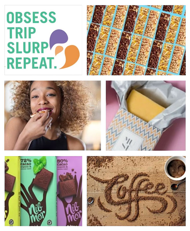
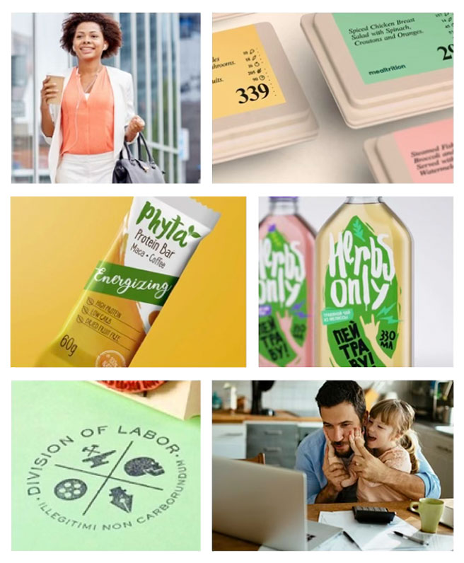
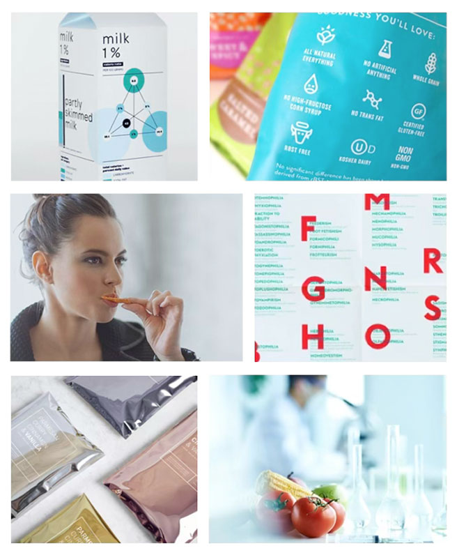
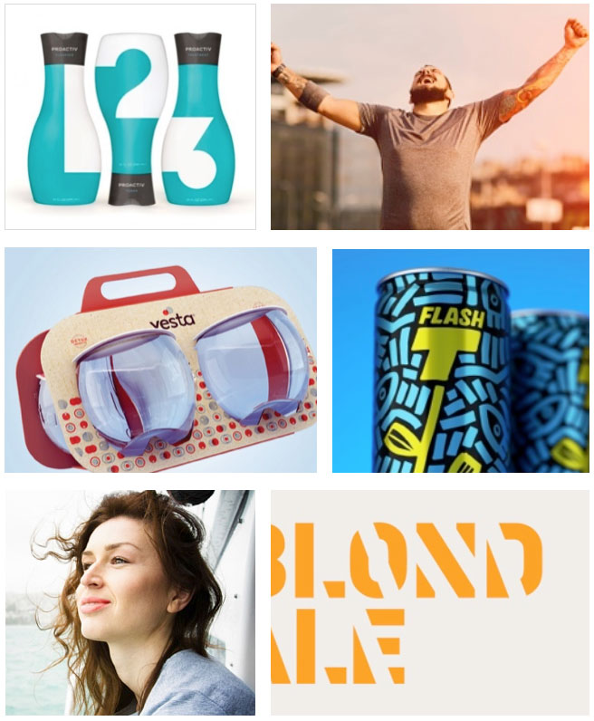
VISUAL TERRITORIES & INSPIRATION.
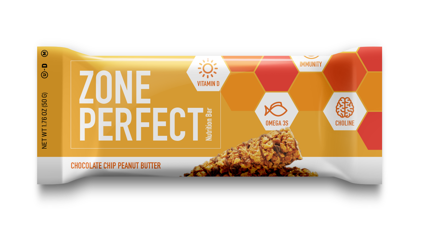
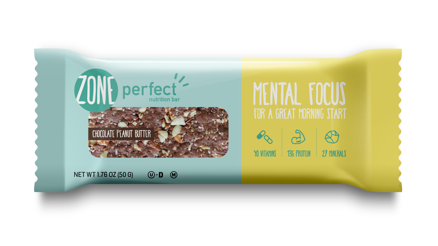
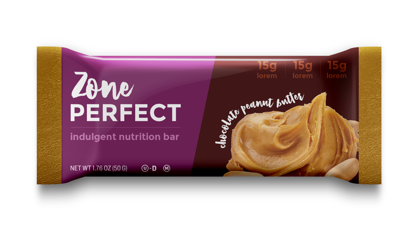
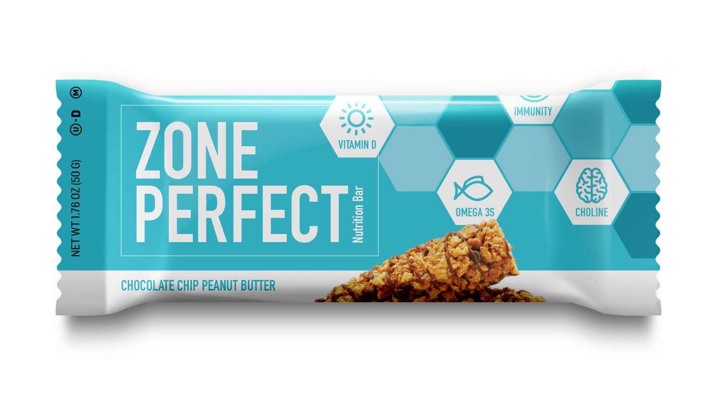
I developed multiple visual territories, deliberately pushing the brand in different directions—from bold monochromatic systems and ingredient-led compositions to color-coded flavor architectures and more expressive typographic treatments.
Each direction explored a different balance of:
Brand recognition · Flavor differentiation · Nutritional clarity · Appetite appeal · Shelf impact
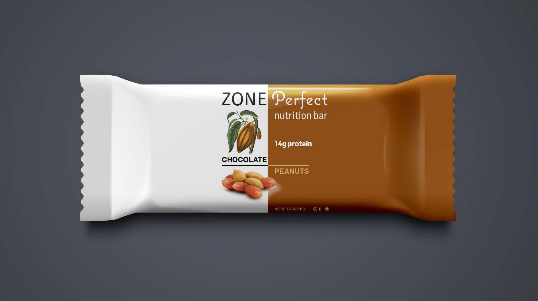
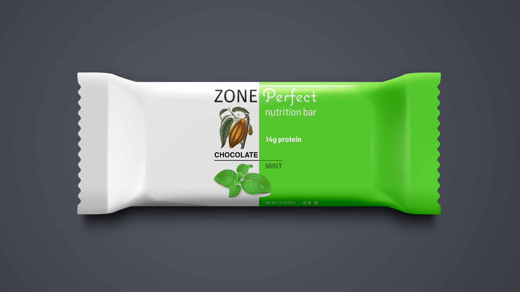
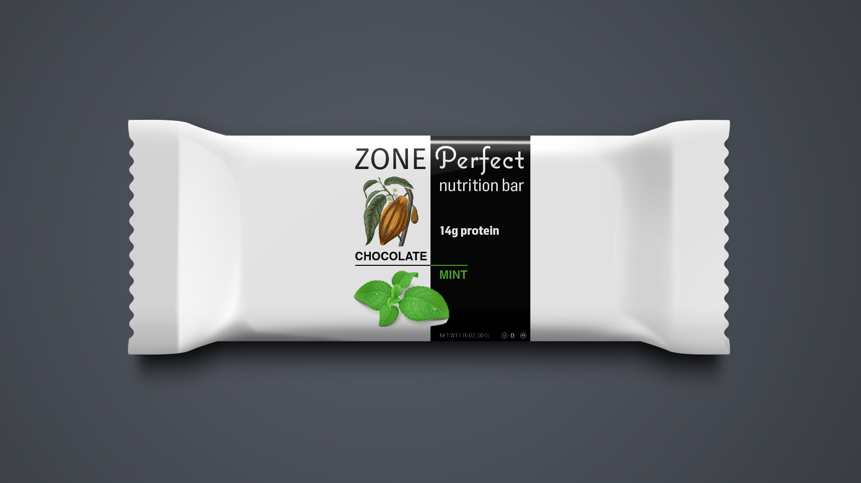
Based on insights from the exploration, I developed four refined packaging directions.
A Scalable System
Rather than designing a single package in isolation, I developed a flexible visual system that could scale across flavors and product variations. Typography, imagery, color, and information hierarchy shift to create distinction while maintaining consistent brand recognition across the portfolio.